2 GIS Data Types and Symbology
In the last chapter we learned how to add GIS data in the map display area and also acquainted to some of the menus and tools of QGIS. In this chapter we will talk a little bit more about the types of GIS data.
GIS data represents the real earth in terms of geometry. There are several types of GIS data, but we will focus mainly on two types of data, namely, Vector and Raster data. Let us try to understand what is represented by these two types of data respectively.
2.1 GIS Data Types
2.1.1 Vector Data
Features on earth can be represented by points, lines or polygons. These geometries are termed as vector GIS data. As we show in the last chapter, the boundaries of countries can be represented as polygon. Following are some of the examples of features that can be represented by each type of geometry.
- Point: Trees, electric poles, electric towers, centroid of polygons, buildings, airport, epicenter of earthquake, meteorological and hydrological stations
- Line or Polyline: River, electric transmission line, roads
- Polygon: Lake, pond, river, buildings, administrative boundary, landuse polygons
Some of the features such as river, buildings etc can be represented by different types of geometry depending upon the purpose of analysis and visualization.
2.1.2 Raster Data
Raster data, such as images, are gridded data which consists of rows and columns of data. Cell is the unit of representation of raster data. Following figure demonstrates the raster data.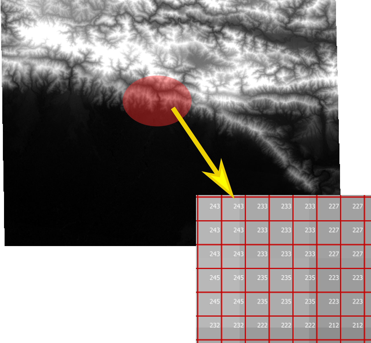
Figure 2.1: Elevation data (one of the most used GIS data)
Figure 2.1 is an elevation data represented in black to white color. Black color represents lower elevation while white color shows higher elevation. Every cell in the raster data has some value which represents the elevation at corresponding point. Raster data can have more than one value for each cell. These are called raster bands. Elevation data shown above has single band.
Figure 2.2 is an image taken by satellite called Sentinel. For every cell there are three values. This raster image has three bands. If we represent each band as red, green and blue color, we get a true color image same as what we see with our eyes. By the way, photographs we take with our digital camera also are three band raster data. We need to assign colors to each band so that we can see the image.
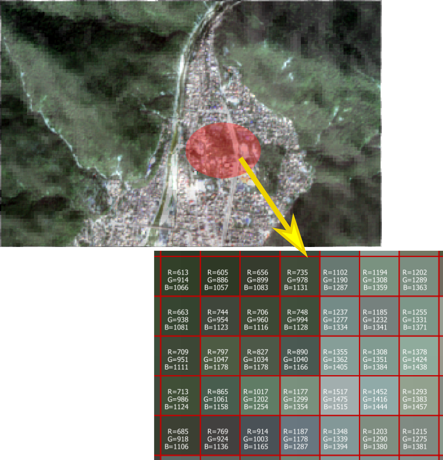
Figure 2.2: Image as Raster data
2.2 Symbology
In the last chapter we displayed the map of countries of the world. All the polygon features were displayed with the same color (fill), and boundaries (boarder) of the countries were displayed in black color. We can change the fill color and boarder color of the polygons based on various attributes of the layer. Representing the GIS data with different colors and symbols is part of Symbology. In the following examples we will try to assign different symbols to vector and raster data.
Download GIS data for Nepal administrative boundary and few other data from following URLs. Create a folder named Exercise02 in your workspace.
- http://ngiip.gov.np/data-center/topographical-data (Data with file name 1000k.zip will be downloaded to your default path when you click on the link named 1000K. Move the file to Exercise02 folder.
http://ngiip.gov.np/data-center/admin-boundary (Click on the link Admin Palika to download the file. Move the file to Exercise02 folder.
Note: The urls listed above were accessed on 23rd January, 2018.
2.2.1 Vector data attributes
Before understanding how we can change the symbols of vector data, we need to know more about the attributes. Following example will show you the types of attribute data.
- Add vector layer ne_50m_admin_0_countries.shp to the map as explained in last chapter.
- Select the layer in the Layers Panel and click on the properties to open Properties dialog box.
- Select Fields in the left pane of the dialogbox, you will see a table of fields as shown in Figure 2.3. Observe the table and click OK to close the dialog.
- Now click Open attibute table tool. It will show you the list of values of each feature corresponding to each field.

Figure 2.3: Attribute type, length and precision
From the above observation we can understand that there are three types of attributes 1) String, 2) Integer and 3) Real(in general). However, in the due course you can find few more types of attributes.
From the Layer Properties dialog box, we know that - Attribute scalerank is an Integer and it can hold 4-digit number (Length is 4). - Attribute featureda and SOVEREIGNT are Strings. Attribute featureda can be upto 30 characters long and SOVEREIGNT can be 32 characters long. - Attribute LABELRANK is Real and its length can be 5 including decimal and 2 digits after the decimal. You can check the data in the attribute table.
2.2.2 Applying Symbols to Vector Data
Following exercise will acquaint you with various ways you can apply symbols to the vector GIS data. What kinds of symbol can we use? 1. Refer to Figure 2.6 in the next example. We can see that based on attributes we can use - Single symbol: Each of the features will have same symbol irrespective of attribute. - Categorized: We can create categories of features based on an attribute of the layer and apply a specific symbol to each category. - Graduated: We can create graduated symbol based on integer or real field(attribute). - Rule Based: We can create rules based on attributes, and for each rule we can define the symbol. The features will be symbolized based on which rule they conform to. 2. Types of symbol: For each type of vector data (Point, Polyline and Polygon) there are different types of symbol. The simplest ones are 1)Simple marker (for point), 2)Simple line for polyline and 3)Simple fill for polygon. However, as shown in Figure 2.13 in the next chapter, we can find many other types of symbol apart from the default ones. Once you click Simple marker or Simple line or Simple fill in the symbol, you can find drop down list of symbols beside Symbol layer type for you to chose. Following example and exploring the layer properties dialog will make you conversant with layer styling and symbols.
2.2.2.1 Exercise: Applying symbol to vector GIS data
- Start QGIS Desktop from windows start menu.
- Find the location of your GIS data Admin-Palika.zip you have just downloaded from the Browser Panel and drag-and-drop to the map display area (as shown in Figure 2.4.
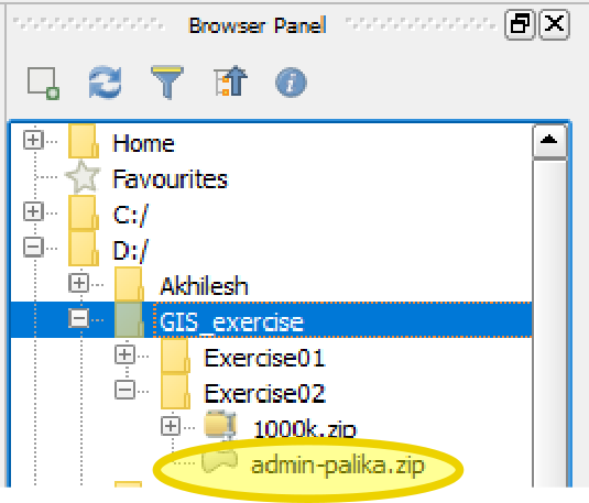
Figure 2.4: Vector data location
- Similary, find 1000k.zip. It consists of more than one GIS data. Therefore it has plus(+) sign on the left. Expand 1000k.zip and add following GIS data (ending with .shp) as layers.
- hydro_ln.shp: Shapefile of rivers as lines
- hydro_ar.shp: Shapefile of water bodies as polygons
- elev_ln.shp: Shapefile of contour lines at interval of 1000m
- trans_pt.shp: Location of airports as points
- trans_ln.shp: Shapefile of roads as polylines
- settl_pt.shp: Name of settlement areas as points
Arrange the layers by dragging each layer so that the polygon layers are at the bottom and points layers are at the top as shown in Figure 2.5.
Save the project as ex02a.qgs. You can save the project during the next steps and pause your exercise and reopen the project again to restart from the last step.
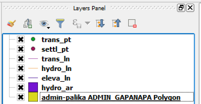
Figure 2.5: Layer arranged to show all the layers properly
Apply symbols to administrative boundary layer.
In the Layers Panel right click on Admin-palika layer and click Properties. See Figure 2.6.
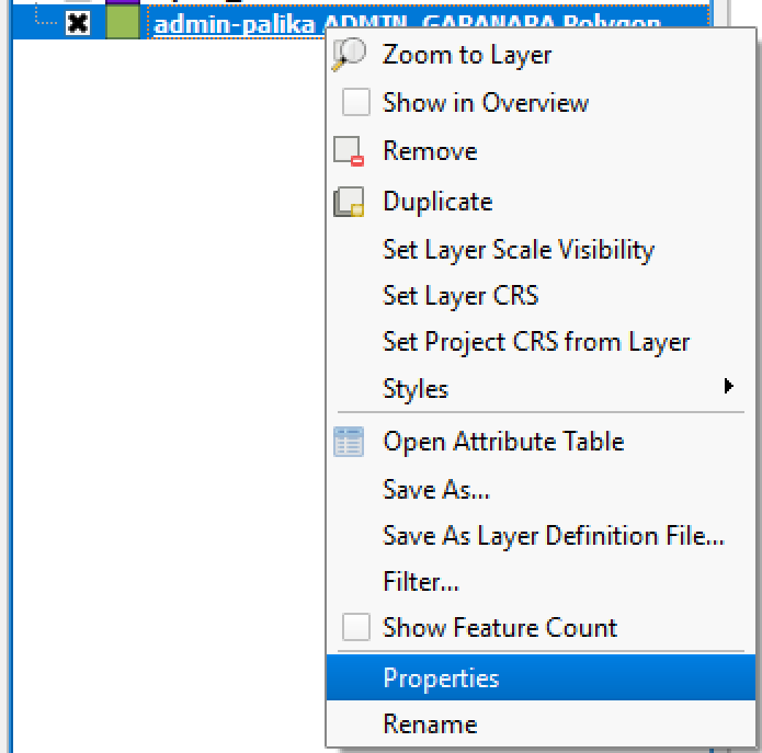
Figure 2.6: Opening layer properties dialog
Alternatively, the dialog can be opened by double clicking the layer from Layers Panel.
From the left pane of dialog box, select style. On the right pane change single symbol to categorized (Figure 2.7).
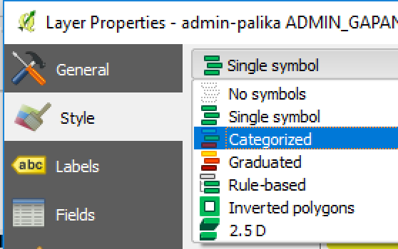
Figure 2.7: Categorized Symbol
You can see a dropdown list beside Column. Select GN_TYPE from the list. Below the list of symbols (which is empty at present), click on Classify. You will see a list of unique values which is extracted from attribute GN_TYPE of the admin-palika layer listed as symbols. If you click on Apply button at the bottom right of dialog, you can observe the change in colors of the layer. In the list of symbols, you will see the following attributes. - Gaunpalika - Nagarpalika - Mahanagarpalika - Upamahanagarpalika - Wildlife Reserve - Watershed and Wildlife Reserve - National Park - Hunting Reserve - Development Area We need to plan the colors for each type based on our purpose. For the present exercise, let us follow the steps below.
Double click on the symbol beside Development Area. From the dialog box, click on the color selection dropdown list and change the color to white (Figure 2.8).
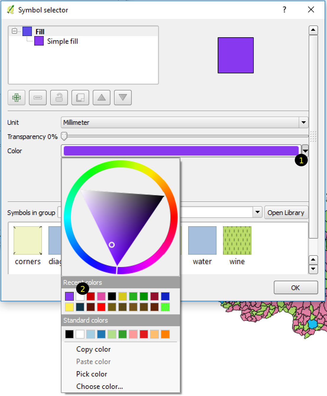
Figure 2.8: Change color of Symbol
Alternatively we can select color from the color wheel and triangle shown in the figure above.
In similar way, select symbols for other GN_TYPES. For Wildlife Reserve, Watershed and Wildlife Reserve, National Park and Hunting Reserve select dark green color, for Gaunpalika dark-grayish-green and different shades of red for Nagarpalika, Upmahanagarpalika and Mahanagarpalika (Figure 2.9). Click Apply button at the lower right corner of the properties dialog box. Now the map looks more recognizable and purposeful.

Figure 2.9: Colors for each category
- Apply symbol to Water body polygons (hydro_ar layer)
Open property dialog for the layer. Click Simple Fill. You will see color settings for fill color and outline color. In the fill color select blue and for outline color check Transparent Color (Figure 2.10).
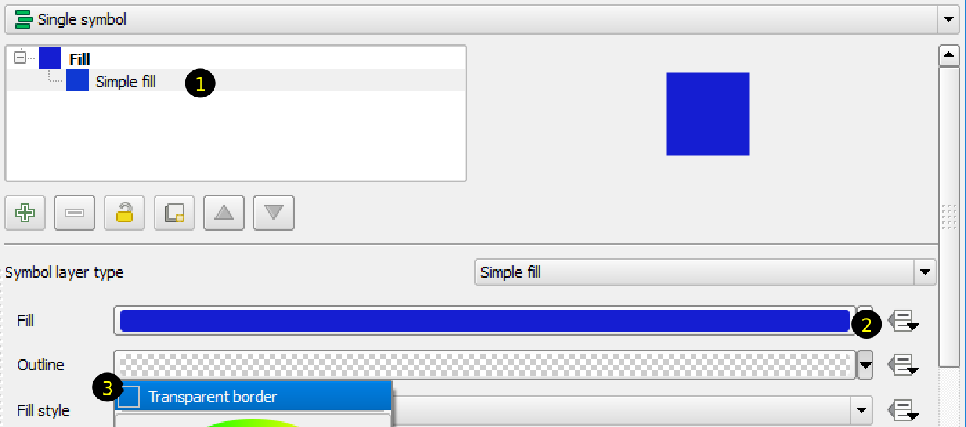
Figure 2.10: Symbol for water bodies
- Apply symbol to rivers (hydro_ln layer)
Open property dialog for river layer. Change the color to blue and width to 0.1. Click OK.
- Apply symbol to roads (trans_ln layer)
Open property dialog for roads layer.
Click plus sign(+) below the list of symbols (Figure 2.11). Now you have to Simple Line symbols in the list. Select the lower one and change the color to dark gray. Change the width to 0.8. Similarly, select the upper Simple line and change the color to yellow and width to 0.4. Click on Apply button.
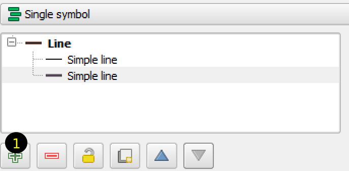
Figure 2.11: Symbol for roads
You can see that the roads are all over Nepal and the map does not look good. We need a categorized road shapefile so that we can show Strategic road network (SRN) more highlighted than other roads. Or, we can symbolize each category of roads differently. By selecting roads (trans_ln layer) in Layers Panel then clicking on Open Attribute Table tool, we can see that there are two attributes for this layer, i.e, FCODE and NAME. If we scroll down the attribute table, we can see that there are many features which do not have NAME. Now we can change the symbol in such a way that the roads without any name will be shown only at low scale. Let us try to do it as explained below.
Open Properties dialog for trans_ln layer. Click Style in the left pane. In the right pane change Single Symbol to Rule-based. Delete any symbol in the list of symbols by selecting it and clicking minus(-) sign below the list. Click plus(+) sign. A dialog box (Edit rule) will appear as shown in Figure 2.12.
Enter the name of Label as you like. Click the button with … sign beside Filter. Expression string builder dialog box will appear. You can find several functions in the list. Expand Fields and Values and double click NAME attribute. Add to the expression so that the expression is:
"NAME" IS NOT NULLWhat does this expression mean? It means we are going to apply a symbol for those roads which has some text in the NAME attribute. Change the symbol to double line by adding one more line in the symbol in Edit rule dialog box as explained before. Now let us add symbol for the roads which does not have any name. In the Property dialog, add rule by clicking on Plus(+) sign. Label it as Other roads. As explained above, set the rule expression as (Note the difference from above expression):
"NAME" IS NULLSet a single line symbol for this rule. To allow these roads to appear only at low scale, check scale range and in the minimum scale input box write 1:200,000.

Figure 2.12: Applying rule based symbol
Click OK button in each dialog box to complete symbol application. - Change the symbol of contour elev_ln layer
As contour is not necessary to be shown at all zooms, we will make it visible at low scale. Also we will make it thin so that it does not mess with the background.
Open Property dialog for the layer.
Select General on the left pane. In the right pane, check Scale dependent visibility and in the minimum scale input box enter 1:500,000.
Select Style on the left pane. Change the color of line to gray. Set the width to 0.15.
Now we have thin colored contour lines which is visible when the scale is bigger than 1:500,000.
- Change symbol of settlement point settl_pt layer
Open Property dialog. Marker is the default symbol for point layers. Move the vertical scroll bar on the right side. At the bottom, you can find few shapes for marker symbol. Let us select star shaped symbol, or as you like. Change the fill and border color as you like.
As explained for contour line layer, change the scale based visibility to 1:500,000.
- Change symbol of Airport trans_pt layer
Open Property dialog. As shown in Figure 2.13, do the following steps.

Figure 2.13: Applying SVG symbol to point layer
- Select Single marker.
- In the Symbol layer type select SVG marker.
- Scroll down to find the SVG Groups in the dialog box.
- Scroll the SVG groups item to find transport.
- From the list of images in SVG Image, select any airplane marker.
- Make the size of the marker bigger and click on Apply button. Adjust the size so that the airport markers are visible in the map.
You can explore many options in the styling and labeling dialog box. There are so many possibilities and impossible to explain each options here. With much practice, it is possible to produce good looking presentable map.
After applying layer symbol, scale based visibility and labels to each layer following maps are produced. Figure 2.14 shows the map at full zoom and Figure 2.15 shows the map zoomed to certain area.
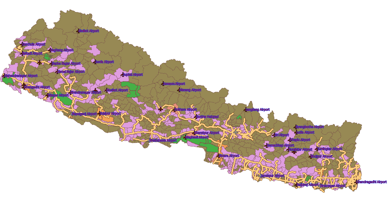
Figure 2.14: Map zoomed to full extent
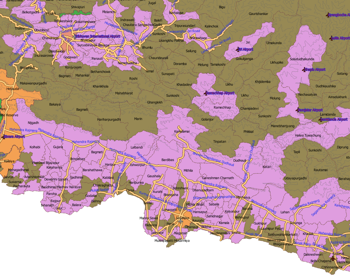
Figure 2.15: Map zoomed to selected area
2.2.3 Applying Symbols to Raster Data
From the previous section, we know that the raster data contains integer or decimal values for each cell in a rectangular grid of columns and rows. Each cell may have single data or multiple data. Raster data can represent different features on the earth. We can demonstrate and learn about raster data from the subsequent example. Before that, we need to acquire some raster data. Raster data are generally memory consuming. We need to download data for our exercise from some websites. If you have slow internet connection, it may take several hours to download some of the data.
Now let us download some of the data as below:
- Global land use data from http://due.esrin.esa.int/files/Globcover2009_V2.3_Global_.zip (Accessed on 24th January, 2018)
- Satellite image data from Sentinnel-2 which is available at https://earthexplorer.usgs.gov/.
- Elevation data from https://earthexplorer.usgs.gov/.
2.2.3.1 How to download data
The first one in the above list can be downloaded directly by clicking on the link or by copying and pasting the link to internet browser. For the second and third ones, which are the same, we need to login to the website. Before login, we need to register to the website. The process of registering and login is self-explanatory. Go for it, and create your account. After opening the URL, you will understand that USGS (U.S. Geological Survey) hosts several different kinds of data. Each data type has link to the explanation about the data. Opening the website and clicking the links to explanation for each types of data, in itself, will be a great learning experience.
Now let us try to understand the methods of downloading each of the second and third data.
2.2.3.2 Method for downloading Sentinel-2 data
- Open the URL and login to the website. In case your browser points to another address after login, return to earthexplorer website again.
- The interface consists of data selection area on the left and location selection interface with map on the right. Zoom and pan the map to desired location. I selected Janakpur area. Click somewhere on the map for which location you want your data. A pin will be added to the map.
On the left frame of the interface, you can find 4 tabs at the top, namely, 1)Search Criteria, 2)Data sets, 3) Additional Criteria and 4)Results. When you select point on the map, the coordinates of the point is added in the search criteria. Additionally, you can input start and end dates in the date range to specify the duration for which you want to search the data.
- Now click Data sets tab. You can find different types of data listed alphabetically. For each type of data set, you can find sub-types by expanding it. Now expand Sentinel near the bottom of the list. There is only one sub-set of this data set named Sentinel-2. Check it.
- Click Results tab. After a few seconds to a couple of minutes, depending on your network speed, you will get satellite images listed on the left frame. You will get a list of satellite image of the clicked point taken at different time.
- For each item in the list you will see a small image on the left, file description at top right and a few tools at the right bottom as shown in Figure 2.16. By hovering over each tool you can know the meaning of each tool.
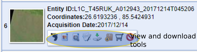
Figure 2.16: Earthexplorer data download tools
- The list is a multi-page list. You can go to next pages by scrolling down clicking on the Next link. You can click Show Browse Overlay tool to see how the image looks. After looking at few images, decide on downloading one. Click Download Options tool and download JPEG2000 format image.
2.2.3.3 Method for downloading Elevation data
Follow all the steps for Sentinel data except in the Data Sets tab, select Digital Elevation \(\Rightarrow\) ASTER GLOBAL DEM. Follow the other steps, you will get a single image in the result. Download it.
2.2.3.4 Apply symbol to land use data
The global land use data downloaded for this exercise, covers large portion of the earth. The data extends from \(180^\circ\) east to \(180^\circ\) west and \(65^\circ\) south to \(90^\circ\) north. We will clip the data to the extent of the boundary of Nepal.
- Clip data to the extent of Nepal.
- Start QGIS. From the Browse Panel find the location of downloaded data (zip file starting with GlobeCover) expand it and add
GLOBCOVER_L4_200901_200912_V2.3.tifto the map. - In the Browse Panel go to the 1000K.zip file used in the last exercise. Add admin_ar.shp file to the map. You will get warning ‘CRS not defined’. We will talk about CRS in the next chapter.
- Click menu Raster \(\Rightarrow\) Extraction \(\Rightarrow\) clipper.
- After the clipper dialog display, follow the steps below (refer Figure 2.17).
- Start QGIS. From the Browse Panel find the location of downloaded data (zip file starting with GlobeCover) expand it and add
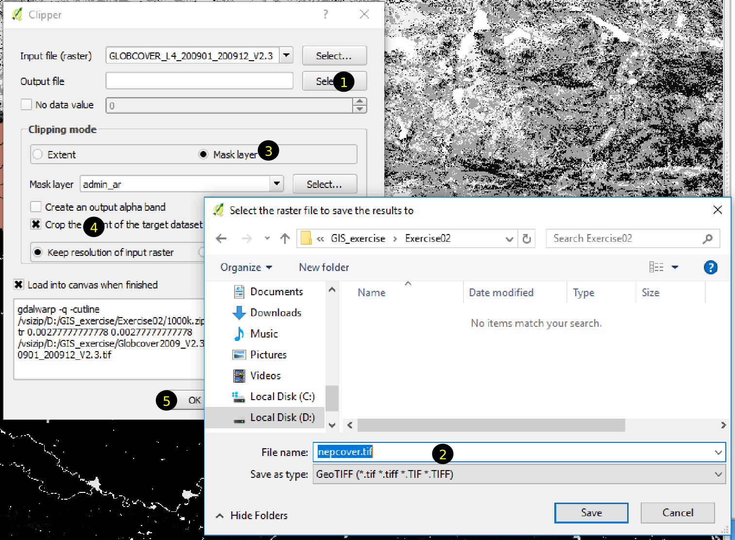
Figure 2.17: Raster clipper dialog
- As shown in the Figure 2.17, click select and go to Exercise02 folder in the save raster dialog. Input the name of the output file, e.g., nepcover.tif and click Save.
- Select Mask Layer radio button. It will take some time before the admin_ar layer is shown in the Mask layer field.
- Check the Crop to the extent of the target dataset
- Click OK. After the clipping finishes, click Close in the Clipper dialog. Save the QGIS project file as
ex02b.qgs. - Apply symbol to the raster data.
Before applying symbol, remove global land cover data and admin_ar layer (See Chapter-1 to remove layers from map). Let us have a look at the raster layer first. In the layers panel, you can see that the land cover of Nepal is represented by black and white color. This is the default symbol for single band raster data. As shown in Figure 2.18, black color represents the value of 11 and white color represents the value of 220 other gray shades represent values between 11 and 220.
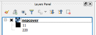
Figure 2.18: Default symbol for single band raster data
Open file browser and go to the location where you downloaded Globcover2009_V2.3_Global_.zip. If you look inside the zip file, you will find an Excel file named GlobalCover2009legend.xls. Let us have a look at the file. Open the excel file with Microsoft Excel or LibreOffice Calc. For each value in the first column, you will see what it represents in the second column. In third to fifth column, it shows the red, green and blue color values suitable for the symbol. We will apply these colors to the raster data and see how our land cover data looks.
Now follow the steps below.
- Open Property dialog for the layer.
- From Render type dropdown list, select Singleband pseudo color, refer Figure 2.19. Singleband pseudo color is used to represent single-band raster data in different colors. If you check the dropdown list for Colors in the Property dialog, you can see a list of graduated colors. For example, if you select a color ranging from red to blue, the lowest value will be represented by red, highest by blue and others in between. You can check this by selecting one from the Color dropdown list and clicking Apply botton at the bottom.
- Change Interploation to exact. What does it mean? If you select linear, all the values in the list will have some color. In case of exact, only those values listed will have colors, others will not have any color.
- Change the Mode to Equal interval, so that we can select number of classes.
- Input 23 in the number of Classes. You can see that there are 23 classes listed in the Excel file, therefore we shall follow it. You will see that the list in the middle of the right pane is populated by values, colors and labels.
- Now let us change the list of values and the associated colors. When you double click a value in the list, you can edit by typing a new value. Similarly, if you double click a color in the list it is possible to change the color. It is also possible to change the label for each values.
First value in the list is 11 and it is okay. Double click the color associated with this value. A dialog with caption Change color will be displayed. In the right pane, you can see input boxes for red, green and blue colors. Input 170, 240 and 240 for each of these three colors (Refer the Excel file for the colors).
Now change the second value to 14 and colors for red, green and blue to 255,255 and 100 respectively.
Change all the values and associated colors accordingly and click Apply or OK button.
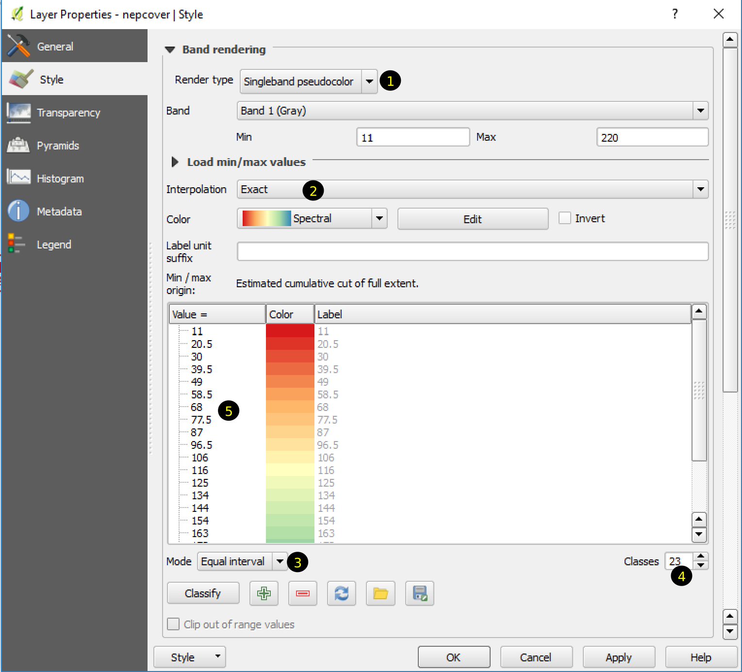
Figure 2.19: Rendering raster with singleband pseudo color
A beautifully colored map of Nepal as shown in Figure 2.20 will be displayed in the map display area. Save the file.
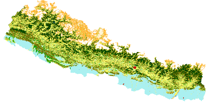
Figure 2.20: Land Cover of Nepal
2.2.3.5 Apply symbol to satellite data
The satellite data downloaded for this example is a multiband data. To understand what each of the band means, you need to explore the dataset tab of earthexplorer website and click on the link to the detailed information for the data as shown in Table 2.1.
| Band.Number | Central.Wavelength..nm. | Spatial.Resolution..m. |
|---|---|---|
| 1 | 443 | 60 |
| 2 | 490 | 10 |
| 3 | 560 | 10 |
| 4 | 665 | 10 |
| 5 | 705 | 20 |
| 6 | 740 | 20 |
| 7 | 783 | 20 |
| 8 | 842 | 10 |
| 9 | 945 | 60 |
| 10 | 1375 | 60 |
| 11 | 1610 | 20 |
| 12 | 2190 | 20 |
Before starting the practice let me explain what we are going to do in this exercise. We will use Sentinel-2 satellite data downloaded already. The image data will be located at D:\GIS_exercise\Exercise02\Sentinel-2\L1C_T45RUK_A011799_20170925T045444 (1).zip\S2A_MSIL1C_20170925T044701_N0205_R076_T45RUK_20170925T045444.SAFE\GRANULE\L1C_T45RUK_A011799_20170925T045444\IMG_DATA. To find the data you will need to explore the path using File Explorer. The name of the zip file and and folders will be different but similar. You can check the file naming system in the earthexplorer website. Inside IMG_DATA folder you will find files with extension ‘jp2’.
In the Table 2.1 central wavelength of each band represents color or spectrum of wave band. Band number 2, 3 and 4 falls in the visible band which our eyes can see as blue, green and red respectively. Spatial resolution of each band represents the length and width of each cell of the raster data of that particular band. We can see that each band has different resolution. We will use visible bands of data for the present exercise. For the purpose of this exercise we will combine three visible bands into one single raster data. We can merge the three bands using QGIS using either of the following methods.
- Using menu Raster \(\Rightarrow\) Miscellaneous \(\Rightarrow\) Merge
- Using Processing toolbox
Processing toolbox consists of hundreds of special tools provided by different software such as SAGA, GRASS etc. We will talk about it in different chapter.
We will use Processing toolbox for the current example. The toolbox is generally visible on the right side of QGIS interface. If it is not visible, you can click menu Processing \(\Rightarrow\) Toolbox.
2.2.3.6 Display satellite data and apply symbol.
We need to add the satellite data to the map. Follow the steps below.
- Open QGIS. In the Browser Panel find the location of downloaded data and expand it.
- Bands of satellite data will be listed as files ending with .jp2. The file names being long, you will need to scroll the panel horizontally to see the full name of data. Select files ending with B02.jp2, B03.jp2, B04.jp2 and drag to the map display area.
- You may add admin_ar shapefile to the map to know which area of Nepal, the data belongs to.
- Each of the images we added to the map represents one of the 3 different bands of satellite data. However, currently, each layer represents single band raster data and as expected, each of them is displayed in gray color. We need to merge these three raster data into single one with 3-bands. It can be done as explained in the next steps, Figure 2.21. Number in the brackets corresponds to the number in the figure.
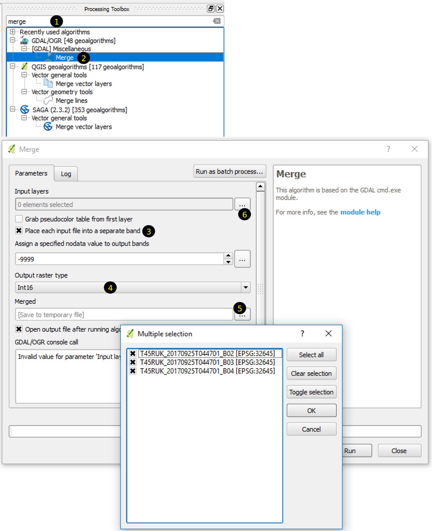
Figure 2.21: Merging rasters in a single file
- In the Processing toolbox search for merge (1). Few tools matching the word will be listed in the toolbox.
- Double click Merge under GDAL (2).
- Merge dialog box will be displayed. Check ‘Place each input file into a separate band’. (3)
- In the Output raster type select Int16. (4)
- Selected Merged output file by clicking on the button (5) and select the folder to save the file. Name the outfile, for example, as
sentinel_rgb.tif. - Click button for the Input layers (6) and select all the images in the Multiple selection dialog and click OK.
- Click Run in the Merge dialog box.
In the resulting image, data acquired from the file ending with ‘B02.jp2’, ‘B03.jp2’ and ‘B04.jp2’ will be assigned to band-1, band-2 and band-3 respectively.
If everything you did as explained above, the tool will run for a few seconds to few minutes depending on the computer specification and the resulting image will be displayed in QGIS as new layer. However, the image still does not look what we observe with our eyes. The colors are not satisfactory.
Let us have a look at the properties of the rgb layer. First reason for this is the default colors for the image display is not correct. Display Properties dialog by double clicking or by right clicking. Select Style in the left pane. You can see on the right pane that the colors selected for red, green and blue colors are band-1, band-2 and band-3 respectively. However, according to the information in the Sentinel, band-3 represents red color and band-1 represents blue color. We need to swap bands for red and blue color on the right pane. For this, change the text in the dropdown list beside red channel to band-3 and text beside blue channel to band-1. Click Apply button. Now the color looks more natural.
Still, the image is not very satisfactory. It is because, the color stretches to whole range each band’s minimum and maximum value. To correct this, we need to correct the stretch. Select Histogram on the left pane. The histogram shows a graph of the number of pixels versus the range of values, refer Figure 2.22. From the figure, we can see that:
- Maximum value for each band is around 12000. However, most of the pixels have values below 4000.
- Minimum value for red band is around 500.
- Minimum value for green band is around 700.
- Minimum value for blue band is around 1000.
Based on these observations, let us change the minimum and maximum values for each band in the Style tab of the Properties dialog. Click Style on the left pane and change the values of each band as 1) 500 to 4000 for red, 2) 700 to 4000 for green and 3) 1000 to 4000 for blue. Click OK button. Now it looks more or less natural color.
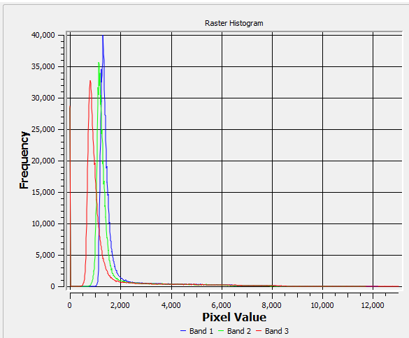
Figure 2.22: Histogram showing range of red, green and blue band values
The final product should look like following figure, with or without cloud depending on the data you downloaded from earthexplorer.
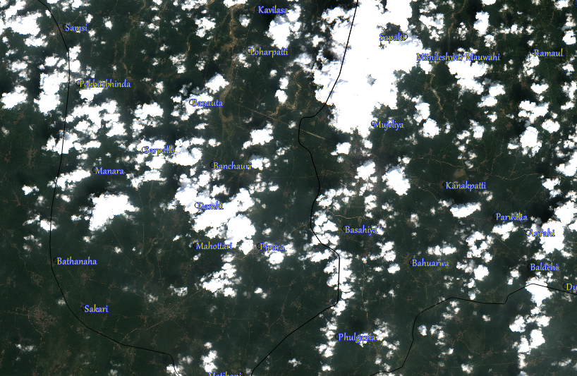
Figure 2.23: Sentinel data in Natural color
2.2.3.7 Display elevation data and apply symbol.
Refer to the section 2.2.3.2. Let us download data for mountainous area. Follow the steps below:
- Open earthexplorer website and login with your credentials.
- Click Add Coordinates in the Search criteria tab and enter the coordinates (\(27.5^\circ\) latitude and \(86.5^\circ\) longitude) as in 2.24.
- Select Data Sets tab. Find and check ASTER GLOBAL DEM under Digital Elevation in the list of data sets.
- Select Results tab.
- Download only data in the list of results.
- Move the downloaded zip file to your working folder.
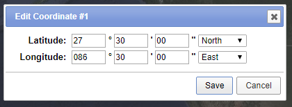
Figure 2.24: Enter Coordinates for elevation data
2.2.3.7.1 Add Raster layer to QGIS
Steps:
- Open QGIS and open Browser Panel
- Find the location of the downloaded zip file
- Expand the zip file and select the file ending with dem.tif (Figure 2.25).
- Drag and drop to the display area.
- Save the project as ex02c.qgs.

Figure 2.25: Add elevation data
2.2.3.7.2 Apply Symbol
The single band elevation raster data will be displayed as black and white image. Black color represents low elevation and white color represents higher elevation. From this display itself we can easily imagine the nature of the terrain. Let us change the color of the display as explained in the following steps.
- Open properties window for the raster layer
- Select Style in the left pane.
- Select Single Band pseudocolor in the render type.
- In the color select new color ramp (Figure: 2.26)
- In the next pop-up select the default gradient.
- For the next dialog, follow the steps below (numbers mentioned in the steps refer to the numbers on the figure 2.27)
- Change the color of (1) to blue
- Change the color of (2) to white
- Double click around (3)
- Click and select (4) and change Relative position to 33.3 and color to green.
- Double click around (5)
- Click and select (6) and change Relative position to 66.7 and color to red.
In this way, we are going to assign white color to highest point, blue color to lowest point and red and green colors to intermediate heights. We could have chosen other colors. But this is just a demonstration of one more ways of symbol application. Click OK on each dialog and have a look at our new map displayed in the display area.
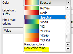
Figure 2.26: Select elevation color
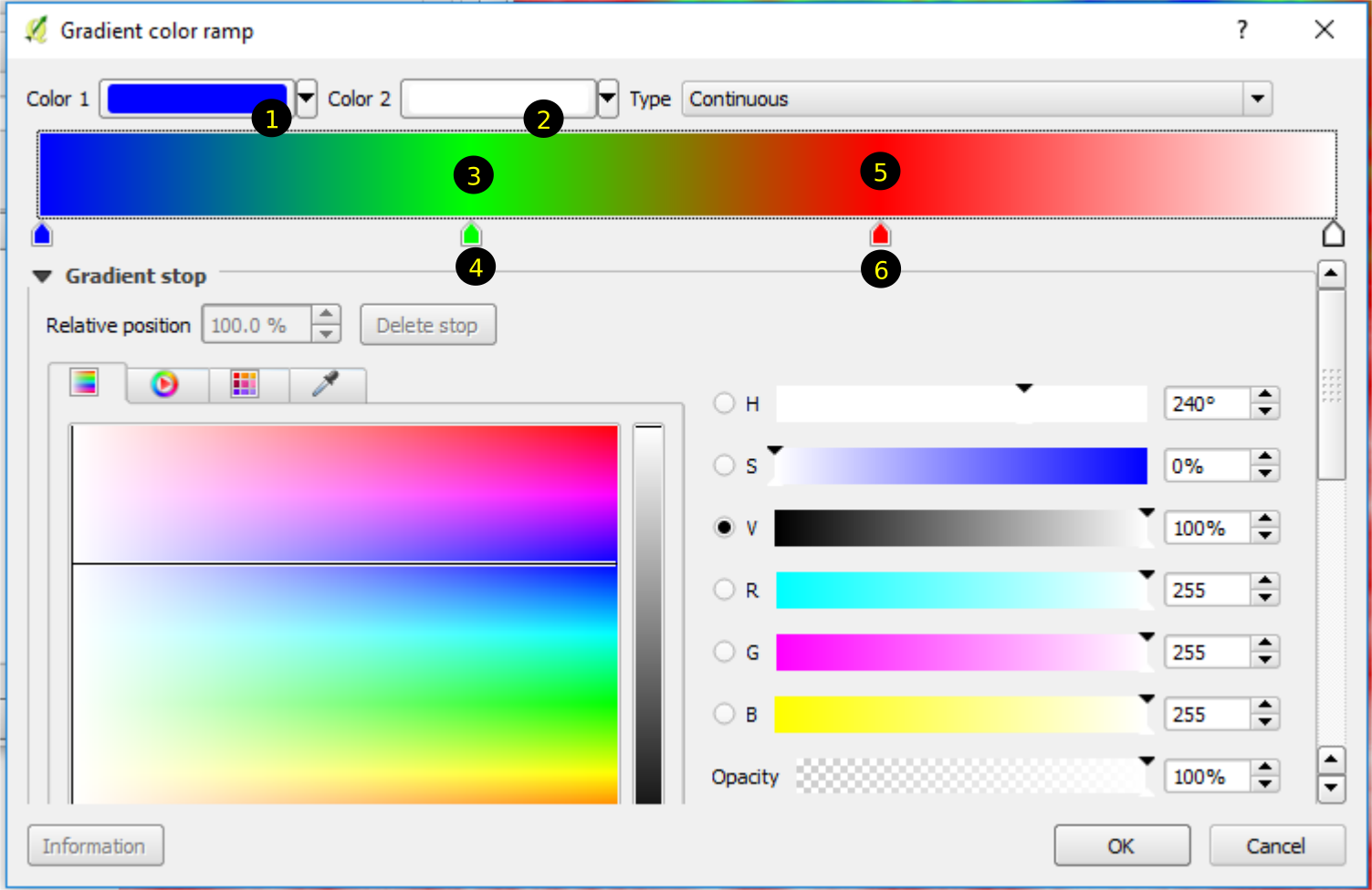
Figure 2.27: Edit elevation ramp
2.2.3.7.3 Create hillshade from elevation data
We can analyze elevation data in various ways. We will have special chapter for this. In the meantime, let us see how this terrain looks from above. Follow the steps below:
- From the Menu select Raster \(\Rightarrow\) Analysis \(\Rightarrow\) DEM(Terrain Models)
- Select output file (for example as hs.tif in your working directory under Exercise02) in the next dialog, keep other things as default. Click OK. Hillshade will be created and displayed.
- Open the property dialog for the newly created hillshade layer.
- Select Transparency in the left pane and set transparency to around 50%. You will get a beautiful display as in figure 2.29.

Figure 2.28: Create hillshade from elevation
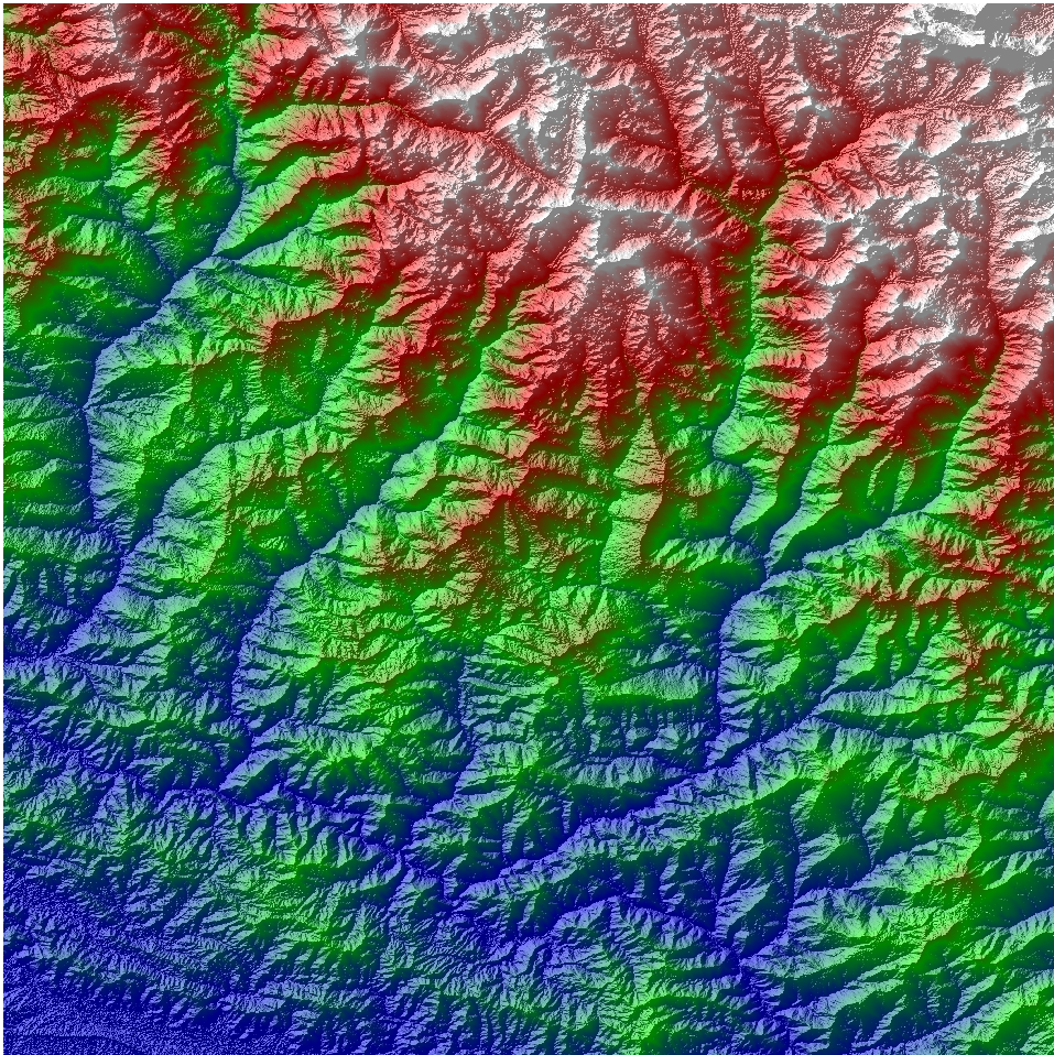
Figure 2.29: Final map of elevation display